Archive for the Blog Category

U.S. Employment Data Mixed

The 288,000 gain in employment in the U.S. was the biggest since January 2012 and followed a revised 203,000 increase the prior month that was stronger than initially estimated, Labor Department figures showed today. The median forecast in a Bloomberg survey of economists called for a 218,000 advance. Unemployment dropped from 6.7 percent to the lowest level since September 2008 as fewer people entered the labor force. Wages and hours worked were stagnant.  More concerning, participation levels declined dramatically.

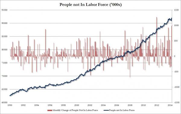
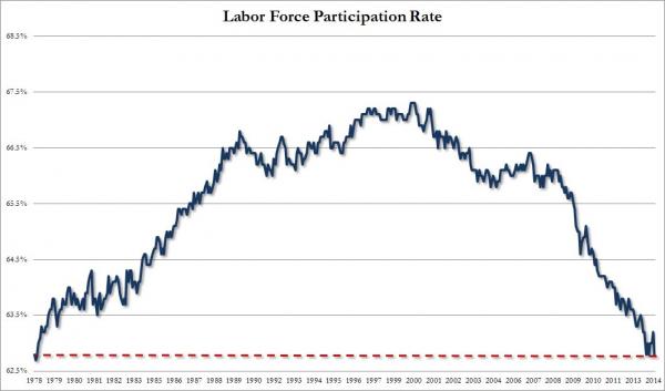
Once again, we are reminded of statistical biases in Labor Market Statistics in the U.S., as provided by the Department of Labour (sorry, Labor).  While the Establishment Survey job number was a whopper, and the biggest monthly addition since January 2012, the Household Survey showed an actual decline of 73,000 jobs. What is much worse, is that the reason the unemployment rate tumbled is well-known: it was mainly due to the number of NON WORKING Americans dropping out of the labor force (i.e. the numerator and denominator of the statistic decrease in same absolutes).  The labor force participation rate crashed from 63.2% to 62.8%, the lowest since January 1978.

Stated in another way, the number of people not in the labor force soared to 92 million, the second highest monthly increase ever, or only 988,000 ‘better’ than January 2012 which curiously was the one month when the establishment survey reported a 360,000 “increase” in jobs.

Zero Hedge puts the end result in great perspective: “the number of people out of the labor force is now an all time high 92 million, and the labor force tumbled by 800,000 to 155.4 million from 156.2 million, as the delayed effect of the extended jobless benefits ending finally hit the stats. What is most amusing is that the “persons who currently want a job” was unchanged at 6,146,000 – even the BLS said it was “puzzled why so many unemployed people are not looking for jobs.” We have some ideas, and no, they don’t include the addition of only 234,000 “birth/death adjustment” jobs.

U.S. Labour (sorry, Labor) Participation Rate:

Participation Rate April_0

People not in the labor force:

Not in Labor Force_0

Mapping the World’s Prices 2014 – Deutsche Bank Report

One of my favorite research reports is the Deutsche Bank annual survey of global prices relative to the U.S.  . Just like the previous editions, it is a comprehensive overview of prices and price indices of a wide array of goods and services from around the world.  In order to ensure that prices in USD are comparable across countries, they do a great job of using products that are standard across countries or have close substitutes.

As in previous years, Australia is overall the most expensive major economy while the United States is still generally one of the cheapest developed countries.  Canada is moderately more expensive, which is predictable given Purchasing Power Parity (PPP) in Canada versus the U.S.  has traditionally been between 78-85 cents USD on the Loonie, depending on the study you look at (actual spot f/X is hovering between 91-92 cents USD today).  For all you economic novices, simply divide those two numbers, to derive my back-of-envelope calculation of the extent to which the U.S. (outside of New York or San Francisco, of course), is ‘generally’ cheaper than Canada.  Brazil remains very expensive for a developing country. However, partly due to recent exchange rate movements, Australia and Brazil have had their prices tempered in US dollar terms.

Most important, Japan is no longer an outlier in most categories due to a weaker JPY and the cumulative impact of years of deflation. There are many cities in the world that are now more expensive than Tokyo !!!!

The Random Walk: Mapping the World’s Prices 2014  -DBAG AG 2014

Figure 1: Relative price levels as implied by IMF’s PPP (US=100): The PPP conversion rates as published have been adjusted with actual foreign exchange rates (as on 07 April 2014 for 2014 figures) to derive the implied price levels.


Zero Hedge on the Death of Equity Hedge Funds

Details
Created on Saturday, 10 May 2014 15:24
Written by Albert Ottoni

Zero Hedge presented a very compelling analysis on Friday showing the weaker recent performances of global hedge-fund managers.  There are some statistical biases in the data, but nevertheless, they are worth noting on an aggregate scale.

I like Tyler Durden’s opening to the data presented, “There’s “hedged” funds and then there’s this”…

20140508_Hdge_0

Zero hedge makes a compelling case that Equity Hedge fund managers have simply become a high cost version of their index-tracking ETF brethren…

20130912_hedge

And performance advantages have dwindled…

20130912_hedge2

as style tilts (growth vs value for instance) have seen increasing correlations…

20130912_hedge3