Archive for the News Category

Greece Is the Word

Written by David Allan

Greece1

Many of you may have heard about this summer’s revival of the 1970’s musical “Greece” by the European Community Theatre.  While this production, like most community theatre, lacks the polish of a Broadway or West End show, it has received so much media and internet attention that a review of the show seems an appropriate choice for my first blog on the TAO Asset Management site.

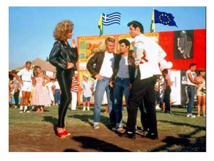
First off, I need to admit that I have not seen the show live.  However, the media has been so inundated with snippets that I feel unexpectedly qualified to provide a review.  The production is being directed by Italian economist and European Central Bank President Mario Draghi.  The lightness of his direction is extremely apparent in the unevenness of the performances.  The casting is no less inconsistent.  The brooding southern European charms of Alexis Tsipras as Danny Zuko and menacing allure of Yanis Varoufakis as sidekick Kenickie are spot on, while the plucky and genial style of Angela Merkel as Sandy Olson cannot hide the fact that at 60 she is simply too old for the role.

The musical numbers are also a problem.  With the exception of an exceptionally poignant rendition of “Business School Dropout” by German Finance Minister Wolfgang Schauble, the songs are largely discordant.  Particularly grating is the number “Greek Pensions”, which starts abruptly and feels extravagant in the context of the scene in which it arises.  The playbill indicates that we can expect a rollicking performance of “Here’s the Loan That You Want” by the entire ensemble in the final Act.  While it is unclear whether this number will be offered in a scornful or heartfelt tone, the production to date leaves the audience with the expectation that this will just be the same old song.

Notwithstanding these faults, the production remains compelling viewing.  The reimagining of the 50s tale of the seeming irreconcilability of greaser Danny and preppy Sandy as a cultural, economic and political conflict between a centre-right German Chancellor and a Greek Communist populist Prime Minister is inspired, as is the protracted, real-time manner in which the story has unwound.  As we move toward the final Act, we are profoundly engaged with the story: will Alexis/Danny don his letterman sweater and embrace conservative economic policies to win favour with Angela/Sandy, or will she instead pull on her Spandex leggings and dance with Syriza?  What makes this particular production even more gripping is the sneaking suspicion that even Director Draghi has no idea where this is heading.

U.S. Employment Data Mixed

The 288,000 gain in employment in the U.S. was the biggest since January 2012 and followed a revised 203,000 increase the prior month that was stronger than initially estimated, Labor Department figures showed today. The median forecast in a Bloomberg survey of economists called for a 218,000 advance. Unemployment dropped from 6.7 percent to the lowest level since September 2008 as fewer people entered the labor force. Wages and hours worked were stagnant.  More concerning, participation levels declined dramatically.

Once again, we are reminded of statistical biases in Labor Market Statistics in the U.S., as provided by the Department of Labour (sorry, Labor).  While the Establishment Survey job number was a whopper, and the biggest monthly addition since January 2012, the Household Survey showed an actual decline of 73,000 jobs. What is much worse, is that the reason the unemployment rate tumbled is well-known: it was mainly due to the number of NON WORKING Americans dropping out of the labor force (i.e. the numerator and denominator of the statistic decrease in same absolutes).  The labor force participation rate crashed from 63.2% to 62.8%, the lowest since January 1978.

Stated in another way, the number of people not in the labor force soared to 92 million, the second highest monthly increase ever, or only 988,000 ‘better’ than January 2012 which curiously was the one month when the establishment survey reported a 360,000 “increase” in jobs.

Zero Hedge puts the end result in great perspective: “the number of people out of the labor force is now an all time high 92 million, and the labor force tumbled by 800,000 to 155.4 million from 156.2 million, as the delayed effect of the extended jobless benefits ending finally hit the stats. What is most amusing is that the “persons who currently want a job” was unchanged at 6,146,000 – even the BLS said it was “puzzled why so many unemployed people are not looking for jobs.” We have some ideas, and no, they don’t include the addition of only 234,000 “birth/death adjustment” jobs.

U.S. Labour (sorry, Labor) Participation Rate:

Participation Rate April_0

People not in the labor force:

Not in Labor Force_0

Mapping the World’s Prices 2014 – Deutsche Bank Report

One of my favorite research reports is the Deutsche Bank annual survey of global prices relative to the U.S.  . Just like the previous editions, it is a comprehensive overview of prices and price indices of a wide array of goods and services from around the world.  In order to ensure that prices in USD are comparable across countries, they do a great job of using products that are standard across countries or have close substitutes.

As in previous years, Australia is overall the most expensive major economy while the United States is still generally one of the cheapest developed countries.  Canada is moderately more expensive, which is predictable given Purchasing Power Parity (PPP) in Canada versus the U.S.  has traditionally been between 78-85 cents USD on the Loonie, depending on the study you look at (actual spot f/X is hovering between 91-92 cents USD today).  For all you economic novices, simply divide those two numbers, to derive my back-of-envelope calculation of the extent to which the U.S. (outside of New York or San Francisco, of course), is ‘generally’ cheaper than Canada.  Brazil remains very expensive for a developing country. However, partly due to recent exchange rate movements, Australia and Brazil have had their prices tempered in US dollar terms.

Most important, Japan is no longer an outlier in most categories due to a weaker JPY and the cumulative impact of years of deflation. There are many cities in the world that are now more expensive than Tokyo !!!!

The Random Walk: Mapping the World’s Prices 2014  -DBAG AG 2014

Figure 1: Relative price levels as implied by IMF’s PPP (US=100): The PPP conversion rates as published have been adjusted with actual foreign exchange rates (as on 07 April 2014 for 2014 figures) to derive the implied price levels.